Status Summary
Refer to the following section for the Status Summary widget details:
| Nodes’ Status Summary |
| Port Link Status Summary |
| Unhealthy Maps |
| Unhealthy Flows |
| Port Drops and Errors |
| Unhealthy Fabric Maps |
Nodes’ Status Summary
The nodes’ status summary widget presents a graph that allows you to quickly view the current status of the physical nodes that GigaVUE-FM is managing and the number of nodes in a particular status, which is indicated by a color in the graph. The possible statuses are:
| Normal (green) |
| Warning (yellow) |
| Error (orange) |
| Critical (red) |
For information about how the device status is computed, refer to Node Health Status.
Hovering the mouse over an area in the graph displays the percentage of nodes in that status. In Figure 1 Nodes’ Status Widget, the widget shows that there are 5 nodes in Normal status, 4 nodes in Warning status, and 5 nodes in Critical status. There are no nodes in Error status.
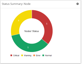
| Figure 37 | Nodes’ Status Widget |
Port Link Status Summary
The Port Link status summary widget allows you to view the current link status of all the ports available in the physical nodes currently managed by GigaVUE-FM. Optionally, the Port Link status can be displayed for the required combination of tag key and tag value (for example: tag key is 'Site' and tag value is 'East'). When a particular site tag is selected, the port link status of all the ports available in the nodes associated to that site are displayed in the Port Link Status Summary dashboard.
Refer to Figure 2 Status Summary: Port Links Widget for Status Summary: Port Links dashboard.
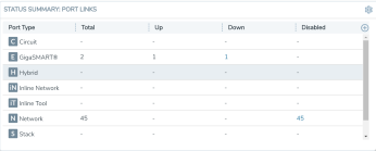
| Figure 38 | Status Summary: Port Links Widget |
The Status Summary: Port Links widget lists the following:
| Ports type |
| Total number of ports in each type |
| Total number of ports in the up, down, or disabled state |
Click the numbers in the down or disabled column. A quick view provides detailed information with the cluster ID, device host name, port ID, and port alias of all the ports in the down or disabled state. If the port status is down, the quick view also provides information about the time since when the port has been in down state. The down time is displayed in minutes, hours, days, or months.
Click the port ID link for a detailed view of the packet errors, packet drops, data rate transmitted or received, packet transmitted or received, and so on occurring on an hourly, daily, weekly, or monthly basis. You can also view the related maps, transceiver type, speed, and other detailed information about the port.
Note: Prior to software GigaVUE‑OS version 4.7, GigaVUE TA Series Traffic Aggregator nodes did not support tool ports. Starting in version 4.7, all gateway ports on GigaVUE TA Series nodes are tool ports. If GigaVUE-FM 3.5 or later is managing nodes running a software version earlier than 4.7, the Ports by Link Status widget may display the number of Gateway nodes.
Unhealthy Maps
The Unhealthy Maps status summary widget lists the maps that are in unhealthy state. The health of a map is determined by the health status of its associated components such as ports, port groups, port pairs, GigaStream, tool port, GigaSMART group, tunneled port, virtual port, inline network, inline tool, inline tool group, inline serial tool group, inline network group, and GigaSMART operations. If the status of any one of the component is down, the corresponding map is also considered unhealthy.
The Unhealthy Maps widget shows the cluster ID, map alias, and current status of the unhealthy map. The possible statuses are:
| Critical (red) |
| Warning (amber) |
| Unknown (gray) |
The health status of a map is shown as gray when the traffic health is still being computed. The status will be updated eventually.
Click on the ID to go directly to the node. Click on the map alias to display the quick view for the map. Hovering the mouse over the status bubble for the map displays the port or ports related to the map that is in an unhealthy state.
Unhealthy Flows
The Unhealthy Flows status summary widget lists the flows that are in unhealthy state. The health of a flow is determined by the health status of the pass-all maps and the priority maps involved in the flow.
A priority map group consists of one or more maps configured with the same source ports. The health of a priority map group is determined by the aggregated health of the constituted maps. The health of the maps is determined by its associated components such as ports, port groups, port pairs, GigaStream, and so on. If any one of the maps in the priority map group is unhealthy, the corresponding priority map group is also considered unhealthy. But, the overall health status of a flow is determined by the aggregated health of the maps that are involved in the flow.
The Unhealthy Flows widget shows the names of the flows that are in unhealthy state and the names of the maps that are unhealthy in the flow. Click the Flow Name to open the flow view page.
For more information about Flows, refer to Flows.
Port Drops and Errors
The Port Drops and Errors status summary widget helps in identifying the ports with packet drops or packet errors in the network. When a particular site value is selected, the status summary widget lists the port types associated to that site and the number of ports having packet drops, transmitting errors, or receiving errors in the site. You can view the number of ports with packet drops or packet errors occurring on a daily or an hourly basis.
Note: To view the unhealthy ports for GigaSMART, the GigaVUE‑OS node must have Software version 5.0.
To view detailed information about the port drops and errors, click the number in the Pkt Drops, Rx Errors, or Tx Errors column. A quick view displays the cluster ID, host name, port ID, port alias, and the number of packet drops or errors for the list of unhealthy ports in the port type. If there are too many ports, click the Filter icon and filter the ports based on the cluster ID, host name, port ID, or port alias. To clear the filters, click Clear Filters in the filter dialog box.
In the Unhealthy Ports quick view, click the port ID for a detailed view of the type of packet errors or packet drops occurring on a daily or an hourly basis. You can also view the related maps, transceiver type, speed, and other detailed information about the port, which helps to investigate the reason for the packet drops or packet errors. To return to the Ports quick view, click Back.
To configure the Inventory widget:
| 1. | On the left navigation pane, click on  and from the Physical & Virtual dashboard page, select the profile in which you want to add the widget. and from the Physical & Virtual dashboard page, select the profile in which you want to add the widget. |
| 2. | Click Add New Widget. The Add New Widget window is displayed. Refer to Figure 3 Add New Widget. |
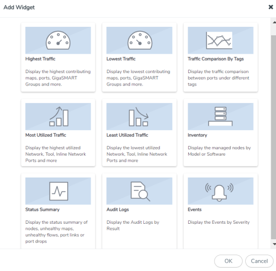
| Figure 39 | Add New Widget |
| 3. | In the Add New Widget window, select Status Summary and click OK. The Status Summary configuration window is displayed. |
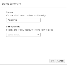
| Figure 40 | Status Summary Configuration |
| 4. | From the Status drop-down list, select one of the following: |
| Node—For information, refer to Nodes’ Status Summary. |
| Port Links—For information, refer to Port Link Status Summary. |
| Unhealthy Maps—For information, refer to Unhealthy Maps. |
| Port Drops & Errors—For information, refer to Port Drops and Errors. |
| 5. | Select the required tag key and tag value combination for which the highest traffic distribution must be displayed. This step is optional. |
| 6. | Click OK. |
Unhealthy Fabric Maps
The unhealthy flow maps widget displays the list of unhealthy flow maps.
The Unhealthy Fabric Maps status summary widget lists the maps that are in unhealthy state. The health of a fabric map is determined by the health status of its associated components such as maps, ports, port groups, port pairs, GigaStream, tool port, GigaSMART group, virtual port and GigaSMART operations. If the status of any one of the component is down, the corresponding fabric map is also considered unhealthy.
The Unhealthy Maps widget shows the fabric map alias and the current status of the unhealthy fabric map. The possible statuses are:
| Critical (red) |
| Warning (amber) |
| Unknown (gray): The health status of a map is shown as gray when the traffic health is still being computed. The status will be updated eventually. |
Audit Logs
The Audit Logs widget shows the audit logs of successful and failed events. Optionally, the audit logs can be displayed for a specified site. When a particular site tag is selected, the audit logs pertaining to the clusters and nodes associated to that site are displayed in the Audit Logs dashboard.
The Audit Logs widget presents a graph that allows you to quickly view the number of logs in successful or failure state. In the graph, the state is indicated by color. The possible log results are:
| Success (green) |
| Failure (red) |
Hovering the mouse over an area in the graph displays the percentage of audit logs in that result. You can also specify the audit log statuses that have occurred over the past hour, day, week, or month. Figure 5 shows the audit log results over each of the time periods.
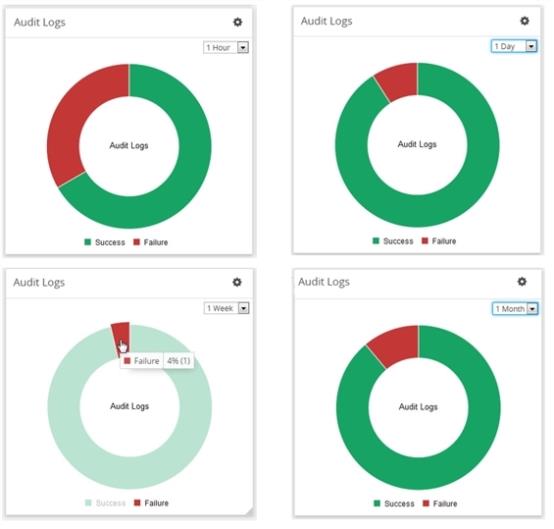
| Figure 41 | Audit Logs by Result |
In this example, the Audit Logs widget shows that there is a log with the failure status that has occurred in the last hour. When you go to the audit logs page, you can see the entries, which matches with the information displayed in Audit Logs widget: two successes and one failure due to an incorrect log in.
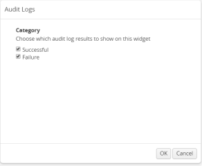
To configure the Audit Logs widget:
- On the left navigation pane, click on and form the Physical & Virtual dashboard page, select the profile in which you want to add the widget.
- Click Add New Widget. The Add New Widget window is displayed. Refer to Figure 3 Add New Widget.
- In the Add New Widget window, select Audit Logs and click OK. The Audit Logs configuration window is displayed. Refer to Figure 3 Most Utilized Traffic Configuration.
- Choose the category of audit log results you want to view:
- Successful
- Failure
- Click OK.
| Figure 42 | Add New Widget |
| Figure 43 | Status Summary Configuration |
Events
The Events widget presents a graph that shows the number of events that have occurred within a particular severity level, which is indicated by a color in the graph. Optionally, the events can be displayed for a specified site. When a particular site tag is selected, only the events pertaining to the clusters and standalone nodes associated to that site are displayed in the Events dashboard.
The possible severity levels are:
| Information (blue) |
| Major (orange) |
| Minor (yellow) |
| Critical (red) |
Hovering the mouse over an area in the graph displays the percentage and the number of events that have occurred within the selected severity level. You can also select the time period to view the number of events that have occurred over the past hour, day, week, or month.
Figure 8 shows the number of events that have occurred in the past week in each severity level for all sites. If you want more detail about the events, select Events in the Physical page.
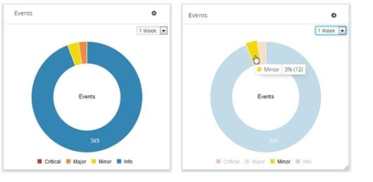
| Figure 44 | Events Widget |
Figure 8 shows the number of events that have occurred in the past week in each severity level for the tag Santa Clara site.
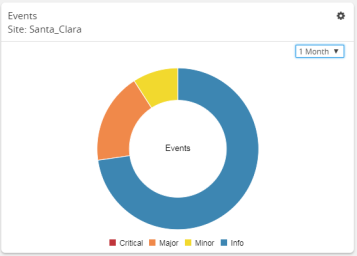
| Figure 45 | Events Widget for Santa Clara |
To configure the Events widget:
- On the left navigation pane, click on and from t he Physical & Virtual dashboard page, select the profile in which you want to add the widget.
-
Click Add New Widget. The Add New Widget window is displayed. Refer to Figure 3 Add New Widget.
Figure 46 Add New Widget -
In the Add New Widget window, select Events and click OK. The Events configuration window is displayed. Refer to Figure 3 Most Utilized Traffic Configuration.
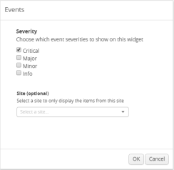
Figure 47 Status Summary Configuration -
Choose the event you want to view in the widget:
Critical Major Minor Info - Select the required tag key and tag value combination for which the events must be displayed. This step is optional.
- Click OK.


