Get Started with Analytics UI
The Analytics option is listed under the Dashboards. To access the Analytics UI:
- On the left navigation pane, click on
 .
. - Select Analytics . The following options are listed:
- Dashboards: Refer to the Dashboards section for details.
- Visualization: Refer to the Visualizations section for details.
- Discover: Refer to the Discover section for details.
- Reports: Refer to the Reports section for details.
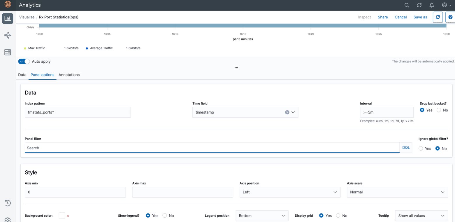
GigaVUE-FM allows you to view the Fabric Health Analytics (FHA) Dashboard with data points having granularity levels for less than 48 hours in Trend Line Dashboards.
GigaVUE-FM provides granularity to all the custom FHA Dashboards or Visualizations.
The following figure shows the available options in the Analytics Dashboard page.
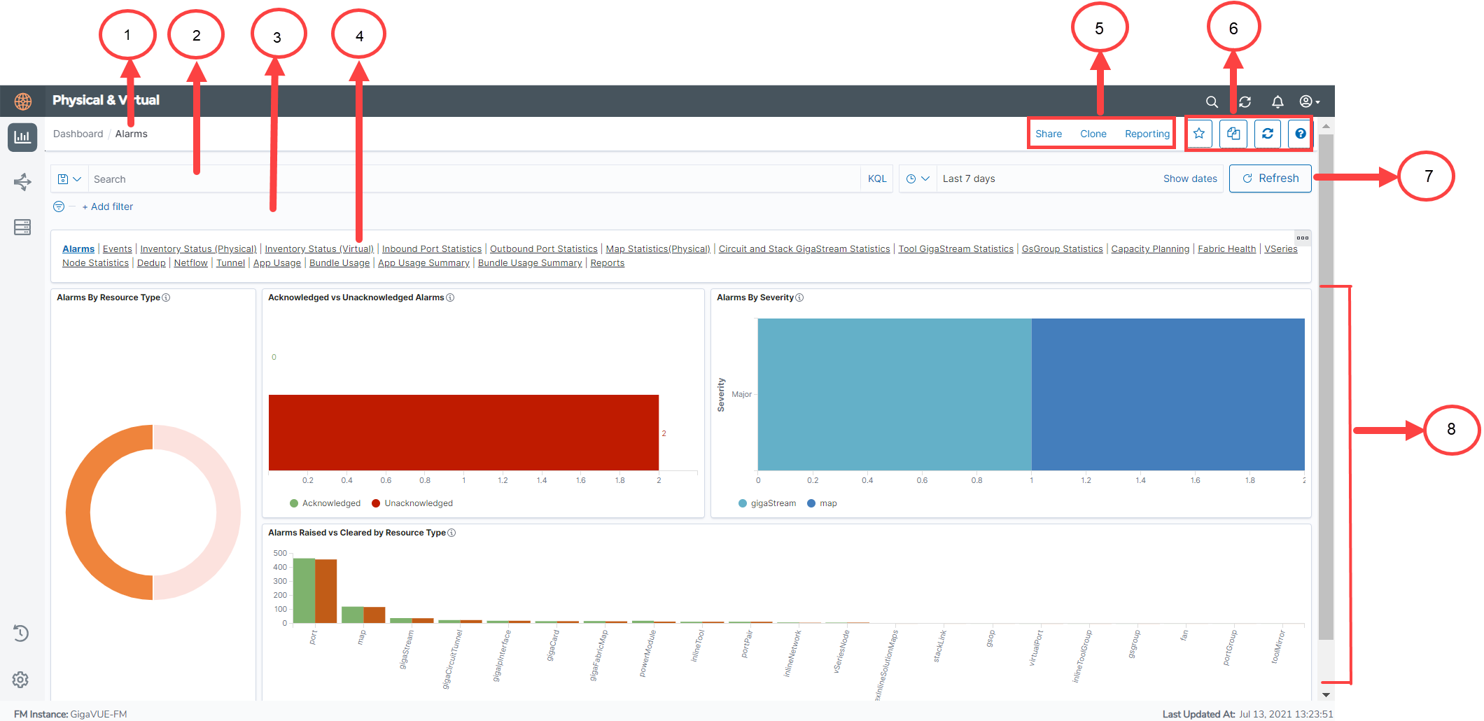
Refer to the following table for details:
| S.No | Description | |
|---|---|---|
| 1 |
Name of the Dashboard: Example Alarms. |
Dashboards |
| 2 |
Search box |
Filter Data in Visualizations |
| 3 | Add Filter | |
| 4 | Dashboard Navigation bar | Copy Dashboard Path |
| 5,6 | Working with the GUI | Work with the Analytics User Interface |
| 7 | Refresh | Use to manually refresh visualizations |
| 8 | Visualizations | Visualizations |
The following table provides the granularity level at which the data is shown in the FHA Dashboard:
|
Interval |
Granularity level at which data is shown |
|---|---|
| Up to 14 hours | 5 minute granularity |
| 15 to 48 hours | 10 minute granularity |
For intervals > 48 hours, 12 data points are displayed, is an expected behavior.
Note: If the analytics are available for < 30 minutes, it is recommended to select 5-minute granularity.