Physical Dashboard Profiles
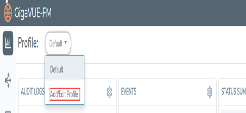
The Physical Dashboard displays a number of default widgets when you first log in. They are displayed with the profile labeled as Default. You can create multiple profiles and choose the widgets to be displayed in each profile based on the data you want to proactively monitor and troubleshoot in your Visibility Fabric.
To create a new profile
| 1. | On the left navigation pane, click on  and from the Physical & Virtual dashboard page, select the profile drop-down and click Add/Edit Profile. and from the Physical & Virtual dashboard page, select the profile drop-down and click Add/Edit Profile. |
| 2. | In the Add/Edit Profile... box, enter the name of the new profile and click Enter. |
The new profile name is displayed under Profiles. The new profile page is displayed.
| 3. | (Optional) Click the Edit icon and select Set as Login Profile if you want the new profile to display as your default Physical Dashboard. |
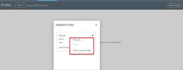
| Figure 18 | Profile Settings |
To change the profile name, click Rename, edit the name, and press Enter.
To delete the profile, click Delete. If you delete a default profile, then the initial default profile is automatically set as the login profile unless you actively select another one. Once deleted, there is no option to recover those dashboards.
Note: When GigaVUE‑FM is upgraded, the profiles created in the previous version are not retained in the latest version.
Keep in mind the following regarding the widgets on the dashboard.
| Widget and trending data is available based on the GigaVUE‑FM license purchased. For the base package, the data is not stored for more than 1 day. The prime package users can select any option including 1 month. |
| Individual widgets can be resized and saved as part of the profile. Each widget can expand in both horizontal and vertical planes. The other widgets self-adjust when the widgets are manipulated. |
| The widgets can also be dragged and dropped to different section of the page. Refer to Physical Dashboard Profiles . |
| The data points can be viewed when the mouse is hovered over the graph as shown in Physical Dashboard Profiles . |
| The widgets such as Unhealthy Maps opens a quick view when clicked on the cluster info or the map alias. The quick view shows more details relating to that specific map. |
| The trending information can also be changed for each widget on the same dashboard. |
| The port and map health status changes on the device reflect instantly on the screen. |
| The color-coded legends are available at the bottom of each widget. |
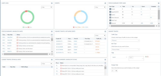
Note: If the percentage displayed in a pie-chart is negligible or less , then it would be difficult to click on the pie-chart arc and view the details .


