Get Started with Analytics UI
The Analytics option is listed under the Dashboards. To access the Analytics UI:
- On the left navigation pane, click on
 .
. - Select Analytics . The following options are listed:
- Dashboards: Refer to the Dashboards section for details.
- Visualization: Refer to the Visualizations section for details.
- Discover: Refer to the Discover section for details.
- Reports: Refer to the Reports section for details.
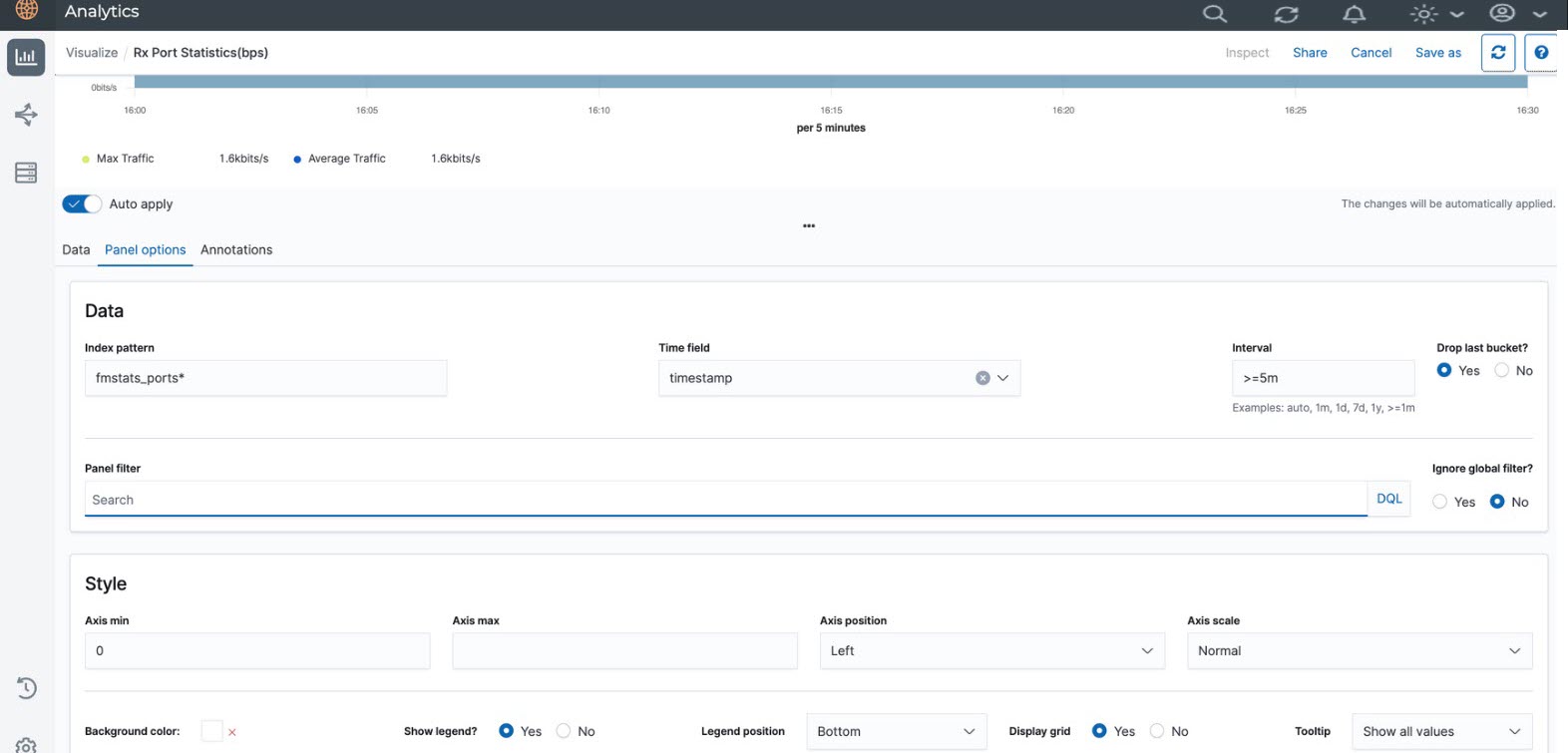
GigaVUE-FM allows you to view the Fabric Health Analytics (FHA) Dashboard with data points having granularity levels for less than 48 hours in Trend Line Dashboards.
GigaVUE-FM provides granularity to all the custom FHA Dashboards or Visualizations.
The following figure shows the available options in the Analytics Dashboard page.
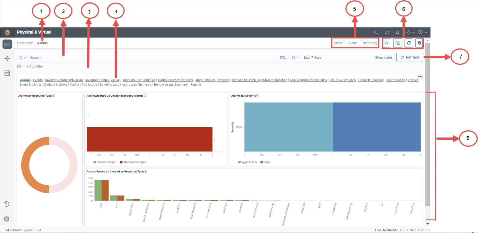
Refer to the following table for details:
| S.No | Description | |
|---|---|---|
| 1 |
Name of the Dashboard: Example Alarms. |
Dashboards |
| 2 |
Search box |
Filter Data in Visualizations |
| 3 | Add Filter | |
| 4 | Dashboard Navigation bar | Copy Dashboard Path |
| 5,6 | Working with the GUI | Work with the Analytics User Interface |
| 7 | Refresh | Use to manually refresh visualizations |
| 8 | Visualizations | Visualizations |
Note: When you cannot view the theme changes applied in Fabric Health Analytics (FHA), clear the browser cache and reload to view the updated changes.
The following table provides the granularity level at which the data is shown in the FHA Dashboard:
|
Interval |
Granularity level at which data is shown |
|---|---|
| Up to 14 hours | 5 minute granularity |
| 15 to 48 hours | 10 minute granularity |
For intervals > 48 hours, 12 data points are displayed, is an expected behavior.
Note: If the analytics are available for < 30 minutes, it is recommended to select 5-minute granularity.