Create Custom Visualizations
You can create custom visualizations by cloning the existing system visualizations or creating a new visualization.
Create a Visualization
To create a new visualization:
- On the left navigation pane, click on
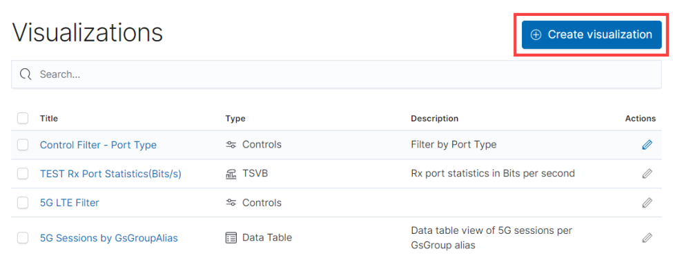
 . Select Analytics > Visualization.
- Click Create Visualization.
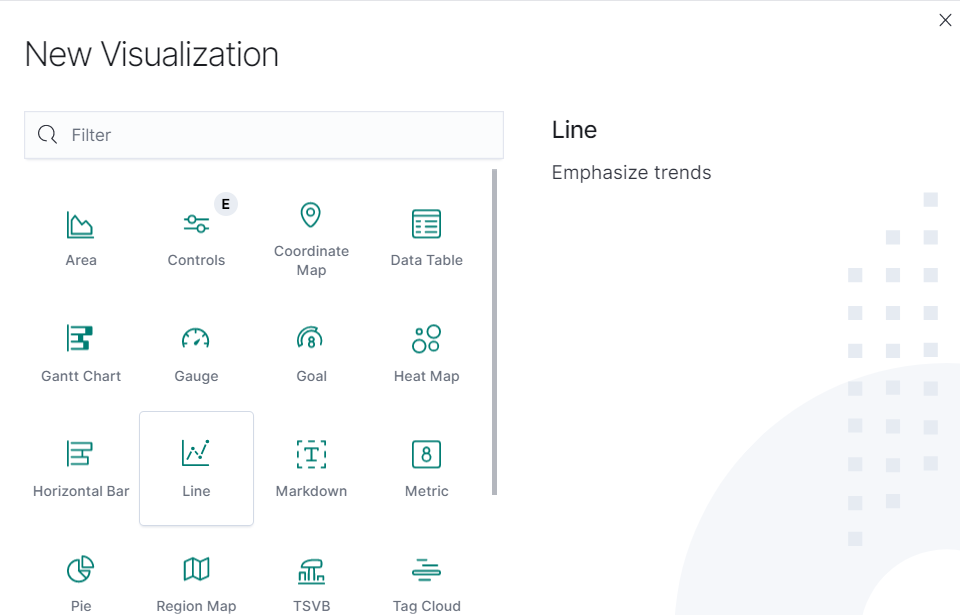
- In the New Visualization page, select the required Visualization Type.
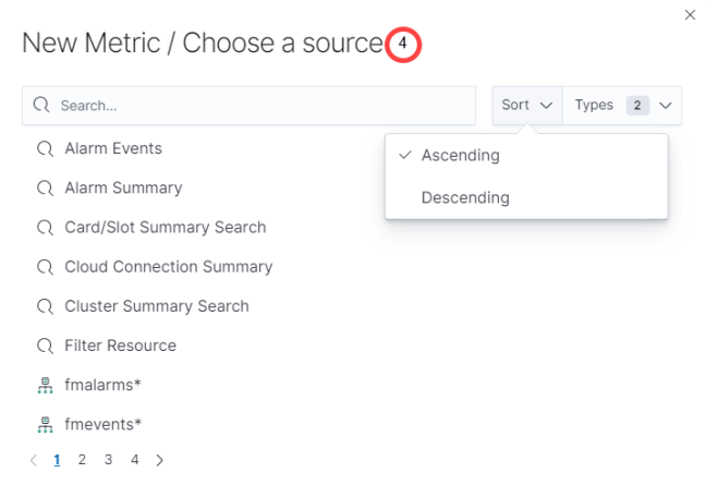
- Select the data source for the visualization.
- Enter the required details for the type of visualization selected. Refer to the table below for more details.
- Click Save.
- In the Save Visualization dialog enter the Title and Description for the visualization and click Save.
|
Type of Visualization |
Description |
|---|---|
|
Metric |
Displays a single number for the selected aggregation. |
|
Data table |
Displays the raw data of a composed aggregation. |
|
Pie Chart |
Display each source’s contribution to a total. |
|
TSVB |
Combines an infinite number of aggregations and pipeline aggregations to display complex data in a meaningful way |
|
Line Chart, Area Chart, Horizontal and Vertical Bar charts |
Compares different series in X/Y charts. |
|
Heat maps |
Shade cells within a matrix. |
|
Markdown widget |
Display free-form information or instructions. |
|
Goal and Gauge |
Displays a gauge |
|
Coordinate map |
Associate the results of an aggregation with geographic locations. |
|
Region map |
Thematic maps where a shape’s color intensity corresponds to a metric’s value. |
Note:
1. When creating TSVB visualizations using derivative aggregation, you have the option to utilize the 'ignore' keyword in the unit field. This can be particularly beneficial when working with counter metrics and aiming to display only the difference instead of the rate per time unit in the graphical representation. Due to OpenSearch's limitation, the visualization's maximum search results will be limited to 10,000 entries. It is recommended to use filters for refined search results.
2. In the OpenSearch dashboards, you can only change the bucket priority by dragging fields if your screen resolution is set to 100 percent.
Clone a Visualization
To clone a visualization:
- On the left navigation pane, click on . Select Analytics > Visualization.
- Select the visualization for which you need to create a clone.
- Make the required changes.
- Click Save As.
- Enter a name for the new Visualization.
- Click Save As. The new visualization will be added to the list page.


