Visualizations - Example Work Flows
This section includes examples for configuring the visualizations:
- TSVB Chart Displaying Traffic Trend
- Pie Chart Displaying Alarms Summary
- Metric Displaying Card Count
- Bar Chart for Alarms by Severity
TSVB Chart Displaying Traffic Trend
To create a TSVB chart that shows traffic trend for every five minutes:
-
Click Create Visualization. In the New Visualization page, select TSVB.
- Click Panel Options.
- Select or enter the following details under Data:
- Click Data and Select Metrics.
- Select Options.
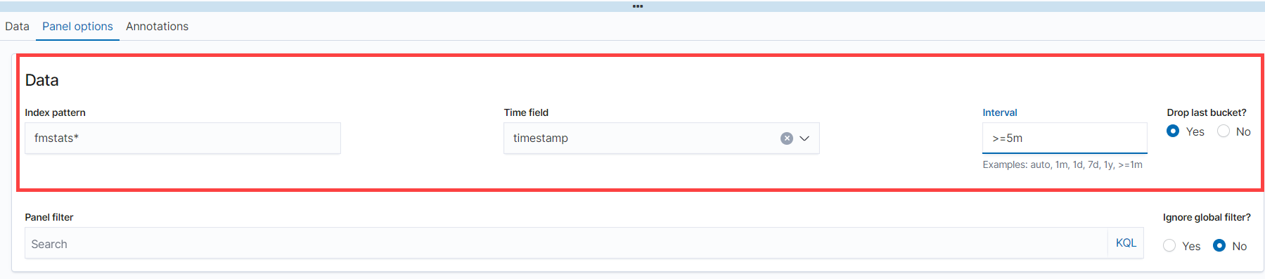
| Index Pattern | fmstats* |
| Time field | Timestamp |
| Interval | Must be >=5 minutes |
| Drop last bucket | Must be checked |
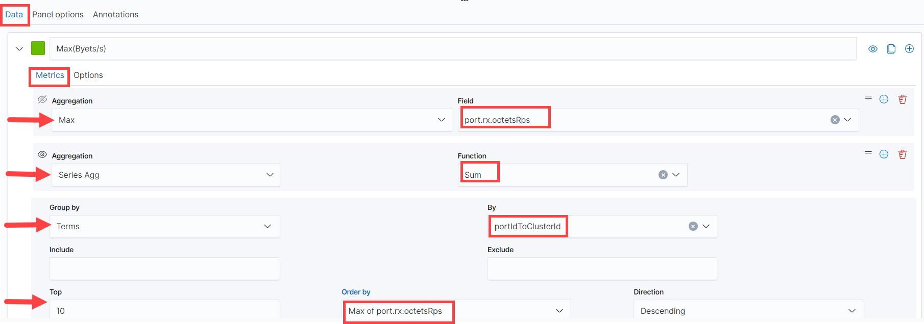 Select or enter the following details:
| Label: Configure the label as Max Rate (Bytes/s) | |
| Aggregation | Max |
| Field | port.rx.octets.Rps |
| Create another aggregation | |
| Aggregation | Series Agg |
| Function | Sum |
| Group By | Terms |
| By | PortIdToClusterId |
| Top | 10 |
| Order by | Max of port.rx.octets.Rps |
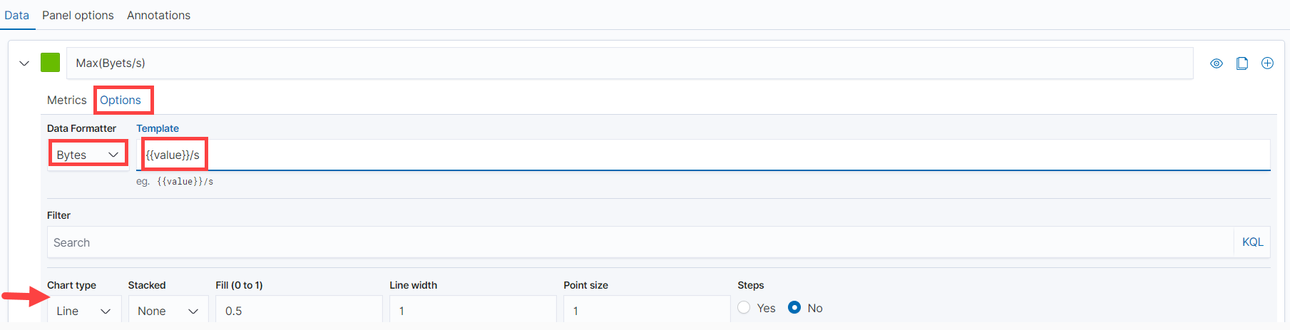
| Data Formatter | Bytes |
| Template | Values/s |
5. Click Save to save the visualization.
Note: Use the chart type option allows you to configure the chart.
Pie Chart Displaying Alarms Summary
To create a pie chart that shows alarm summary:
- Click Create Visualization. In the New Visualization page, select Pie.
- Select the data source for the visualization. It can be either an index pattern or a saved search object. In this example, Alarm Summary is selected as the data source.
-
Click Data.
Configure the Metrics and Buckets as shown in the following figure.
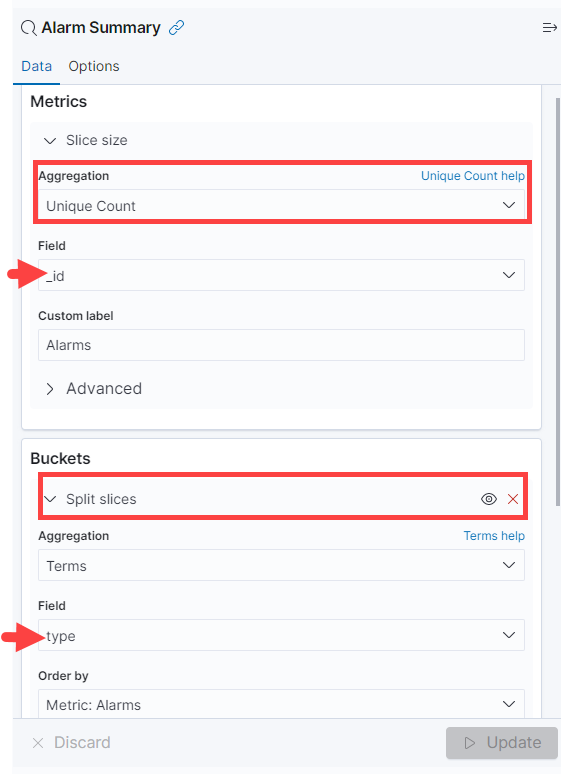
- Aggregation function: Select Unique Count. This returns the number of unique values in a field.
- Field values: _Id and Type can be changed as per your requirements
- Field value _Id: The field that you want to visualize (in the example, id is being used because it is unique for each node)
- Field value Type: The Field that you want to use to split the pie chart (in the example, type is being used to slice the chart)
- Click Update to update the visualization.
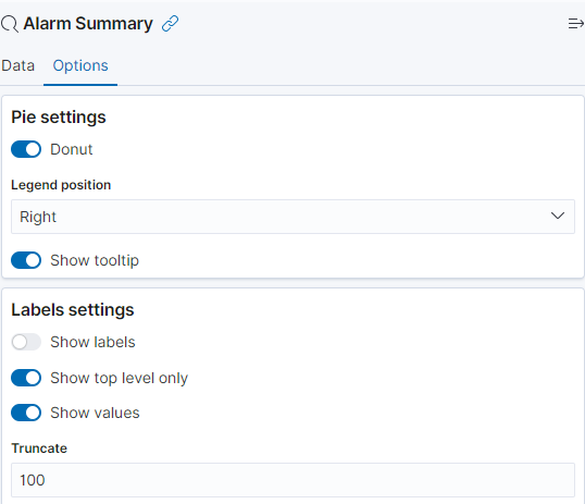
Note: Use the Options tab to configure the required visual effects such as configuring the pie chart as a donut, adjusting the position of the legend, and so on.
Metric Displaying Card Count
To create a Metric visualization that shows the number of cards:
- Click Create Visualization. In the New Visualization page, select Metric.
- Select the data source for the visualization. It can be either an index pattern or a saved search object.
- Configure the Aggregation as Count.
- In the Add Filer option, configure the following:
- Filter: resource.type
- Operator: is
- Value: Card
- Click Update.
Refer to the following image:
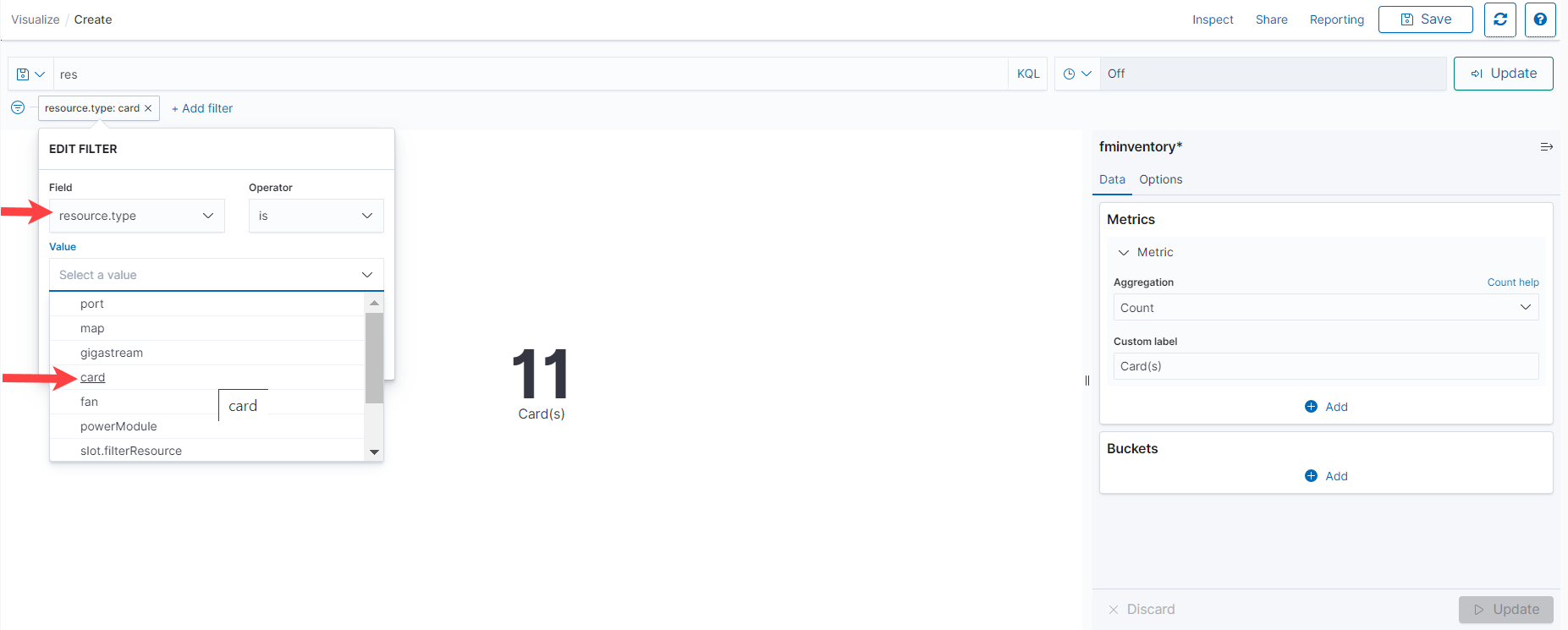
Note: Use the Options tab to configure the required visual effects such as adjusting the font size.
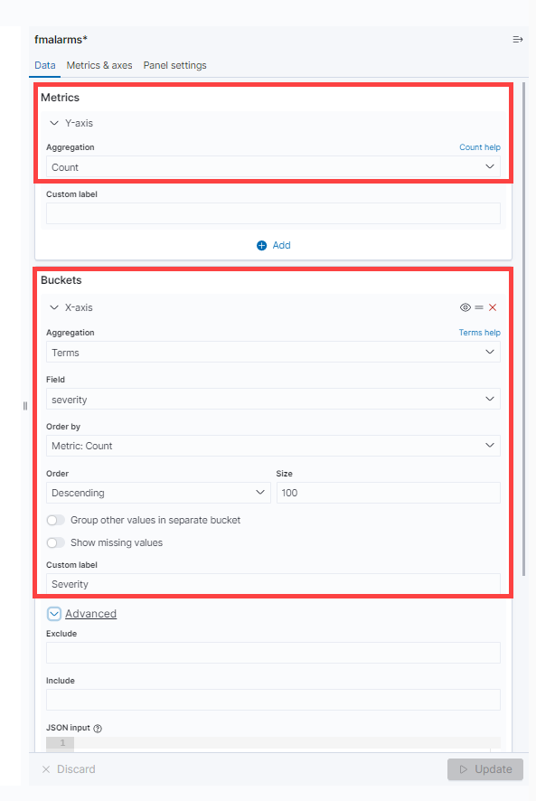
Bar Chart for Alarms by Severity
To create a bar chart that shows the number of alarms based on severity:
- Click Create Visualization. In the New Visualization page, select Vertical Bar.
- Select the data source for the visualization. It can be either an index pattern or a saved search object. In this example, fmalarms is selected as the data source.
- Click Data. Configure the Metrics and Buckets as shown in the following figure.
- Metrics
- Aggregation: Count
- Bucket
- Aggregation: Terms
- Field: Severity
- Order by: Metric Count
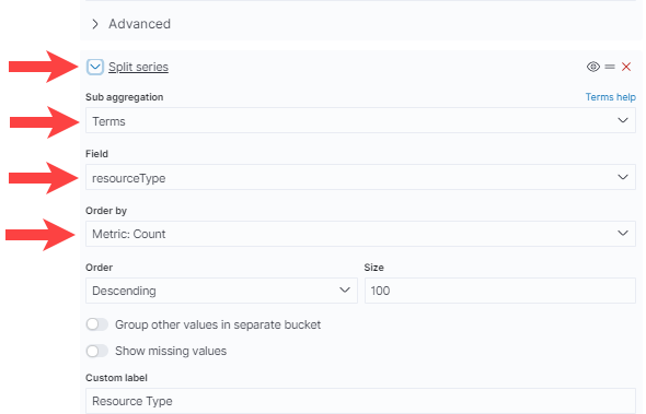
- Under Advanced, select Split series and configure the following:
- Sub aggregation: Terms
- Field: resourceType
- Order by: Metric Count
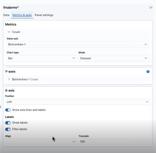
- Under Metrics & Axes, configure the following:
- Click Update.