Filter Data in Visualizations
Fabric Health Analytics provides various options to filter your data:
-
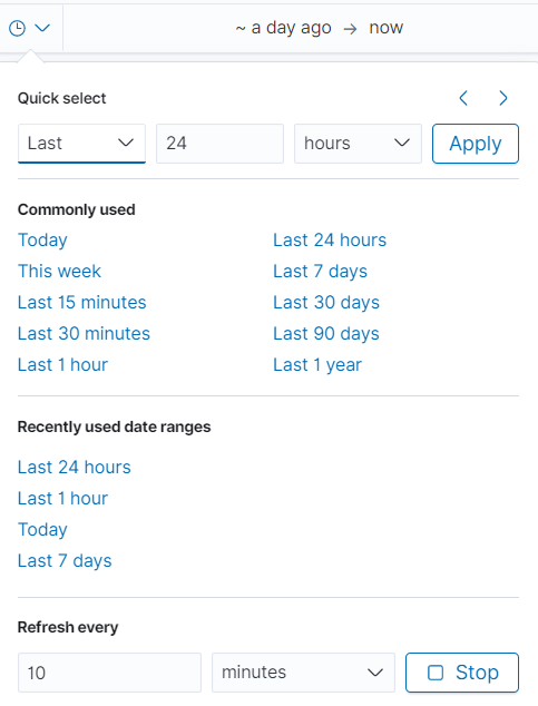
Time Filter: Use time filter to retrieve search results for a specific time period.
Use the Refresh option to refresh the dashboards for the selected time interval. It is recommended to configure a longer time interval.
Use Quick Select option to change the time interval.
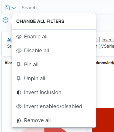
Use the CHANGE ALL FILTERS to configure the following options:
- Enable all: Enables all saved filters
- Disable all: Disables all saved filters
- Pin all: Filter is applied to all the dashboards
- Unpin all: Filter is no longer applied to all the dashboards
- Invert Inclusion: Included filters will be inverted.
- Invert enabled/disabled: Enable and disable options are inverted
- Remove all: Removes all filters
Filtering in visualizations:
- Select and drag an area of the visualization for a specific time interval. All the visualizations in the dashboard get updated for that time interval. The time interval also gets updated in the Quick Select.
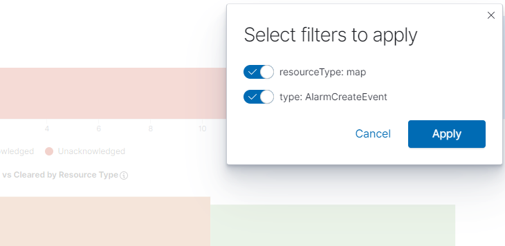
- Double click on an area in the visualization and select the required filters to apply.
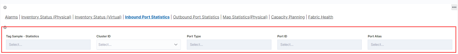
Control Visualizations: Use Control Visualizations to filter the data based on tags. For example, in the Inbound Port Statistics visualization, you can filter the data based on the cluster id, port number, port id or port alias. Refer to the following sections:
 .
.