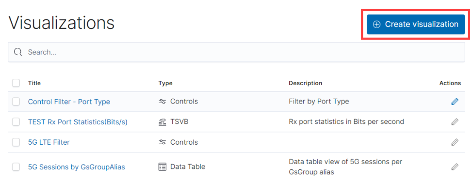
Create Custom Visualizations
You can create custom visualizations by cloning the existing system visualizations or creating a new visualization.
Clone a Visualization
To clone a visualization:
- On the left navigation pane, click on
 . Select Analytics > Visualization.
- Select the visualization for which you need to create a clone.
- Make the required changes.
- Click Save As.
- Enter a name for the new Visualization.
- Click Save As. The new visualization will be added to the list page.
Create a Visualization
To create a new visualization:
- On the left navigation pane, click on . Select Analytics > Visualization.
- Click Create Visualization.
- In the New Visualization page, select the required Visualization Type.
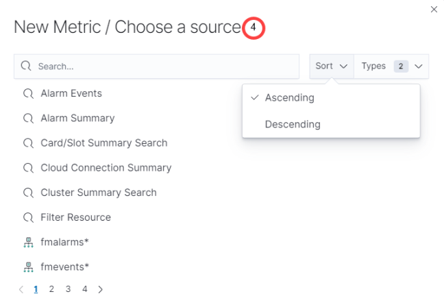
- Select the data source for the visualization.
- Enter the required details for the type of visualization selected. Refer to the table below for more details.
- Click Save.
- In the Save Visualization dialog enter the Title and Description for the visualization and click Save.
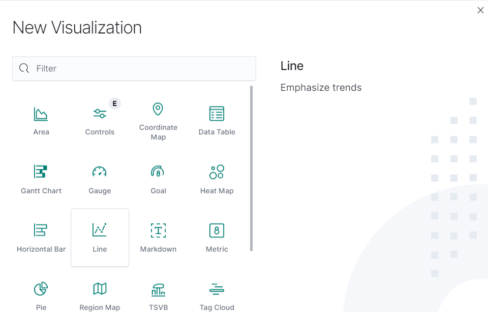
| Type of Visualization | Description |
|---|---|
| Metric | Displays a single number for the selected aggregation. |
| Data table | Displays the raw data of a composed aggregation. |
| Pie Chart | Display each source’s contribution to a total. |
| TSVB | Combines an infinite number of aggregations and pipeline aggregations to display complex data in a meaningful way |
| Line Chart, Area Chart, Horizontal and Vertical Bar charts | Compares different series in X/Y charts. |
| Heat maps | Shade cells within a matrix. |
| Markdown widget | Display free-form information or instructions. |
| Goal and Gauge | Displays a gauge |
| Coordinate map | Associate the results of an aggregation with geographic locations. |
| Region map | Thematic maps where a shape’s color intensity corresponds to a metric’s value. |


